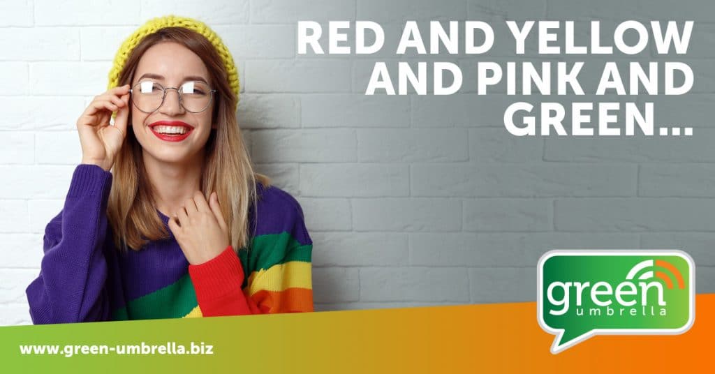
Red & Yellow & Pink & Green.….Why Colour Choice is so Important in Marketing
Red & Yellow & Pink & Green.….Why Colour Choice is so Important in Marketing
I’m old enough not only to remember the words to the song referenced in the title (I Can Sing a Rainbow) but to also remember the early days of word processing.
Oh, the temptations it dangled before us! Exciting fonts, any one of which could be printed in a whole array of colours – and on any colour background we chose. After boring old black on white for so many years, it was a liberating experience.
It takes more than Word Art to excite us
These days, we are all a tad more sophisticated. It takes more than a bit of Word Art to excite us. But colour choice is so important in your marketing communications – from web pages to brochures to emails, print or online – the wrong choice of colour can dramatically reduce the audience reach you achieve.
Hopefully, nobody reading this is using red type on a blue background – or vice versa. If you are – change it immediately. The human eye cannot focus on shades of red and blue at the same time. It makes this combination exceptionally hard to read, with the type seeming to almost vibrate on the background.
Blue is also extremely hard to read comfortably on a dark grey, burgundy, dark green or black background. And if you must have red text (and do question yourself hard on this necessity), avoid grey, greeny blue and black backgrounds.
Talking of black backgrounds – this is my pet hate. It seems to be prolific these days. Text of most colours on a black background is very tiring on the eye. And I recently discovered that this is particularly so for the 50% of the population who have astigmatism (that includes me – it means a rugby ball as opposed to a football shaped eye). My eyes actually start to ache as I try to read white copy reversed out of a very dark background. And on a practical note, for printed material, dark backgrounds show every fingerprint. If you are really wedded to your trendy black page, try a grey or green text instead of white. And if you are sure you want to reverse out white text, try it on a mid-green background – a bit like the shade classic cars come in.

Trade-off
When choosing your colour scheme, there is a trade-off between contrast and readability. We are told by everyone, such as TV salespeople, that a high contrast is good – but yellow on black is the highest contrast combination, and it is not a pleasant reading experience. Too little contrast does indeed make things hard to read, but too much is so vibrant that it also causes problems. The trick is to get the balance right, and trial and error is the best way to go. There are any number of colour picker tools available online, use one as a starting point and try different combinations. Put the combinations side by side so you can see how they compare and ask several people which are easiest to read.
As a marketer, aesthetic appeal is very important to anything I create, but not at the expense of readability. It’s no use producing something beautiful if no one bothers to read the content.
Experienced business to business marketing consultant helping organisations plan and implement marketing plans
Share this!