Way back when I first started at Green Umbrella, I remember GU’s founder telling me a story about when she set up her recruitment agency back in 2003.
She was just starting out and didn’t really understand branding at the time, she was printing her own MS Publisher designed leaflets on her little Epson Inkjet and thinking how great they were. Her first lesson in design and marketing came from a marketing consultant, Karen O’Mahoney (you may have seen her on Live Lunch or writing guest blogs for us in more recent times!).
Karen’s words of wisdom
Karen had asked to see every bit of marketing collateral for the business. Everything from Deskpads to coasters, leaflets, letterheads, compliments slips, business cards, etc. Everything was presented with pride, Karen then spread all these items over the boardroom table and used various other items to cover up the actual logo of the business.
Karen then asked one of the most powerful questions you can when it comes to brand “What is it about all of this “stuff” that makes you know that it’ is Ethos Recruitment’s your business”?
The brand was green and many of the items were green, so that seemed an obvious answer to the question. Karen then asked, “what green is your green?”. “Can you see the same dark green on any of your other items?” It’s probably no surprise for me to tell you that everything was a different shade of green. Karen’s next question was about fonts… the conversation went from there and with each of these questions a deeper understanding of what brand really is developed.
Obviously, I’m retelling someone else’s story here, what’s important though is that you understand branding in order for you to get the most from your designs and present your brand in the way it should be. We work on a bunch of branding projects and there are some simple things that come up again and again that you should consider whether you’re going to town in Canva creating your brand for yourself, or working with a designer.
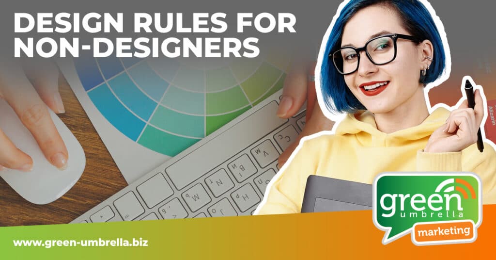
On that note, here are five tips from Mark, our in-house designer.
1. Limit your typefaces and keep them in the family
The human eye finds it difficult to read multiple typefaces, so we advise clients to stay with a simple collection of fonts, or a family of fonts. If a design is too busy then this causes confusion in the brain as the eye does not know where to look. Ideally, you want your viewer to have a pleasant experience, so keep to the golden rule of no more than two to three different fonts.
The font(s) you choose need to reflect your brand. For example, don’t use a script type font if you are an accountancy practice or a legal firm – unless you are Saul Goodman! ;-). There are whole articles out there of course on the misuse of good old Comic Sans!
2. Create order with alignment
It is important to make sure that elements of your design are lined up for design balance and composition. Most design applications, whether that be something like Canva or any of the Adobe Cloud products all have options to use guides and grids.
If you are using an iPhone to take photos for your social media accounts, then the same principle applies. Activate the “grid” feature on your phone, so that you can easily set your composition and place elements in the right place. Go to settings > camera > grid
3. Remember, white space is a good thing
As non-designers, we tend to see white space and want to fill it with yet another sales message, but you need to resist. Give your content some breathing room and let your audience focus on the important elements of the design. Leaving white space is a hugely beneficial design technique and not one to be ignored. Often, less is more.
4. Know your platforms
How often have you seen an image on Facebook or Instagram that is chopped off at the end? Perhaps it’s a square image, and the company have tried to fit it into a circle as a profile picture. It looks naff and reflects badly on your brand.
Every social media platform has specific dimensions, and they also change on a regular basis (which is very frustrating). We have an Image Size Sheet here or many applications like Canva will have preset sizes ready for you to use.
5. It’s all about the images
Please do not search on Google images, right-click, save picture as… on ANY of your designs or social media posts; not unless you want the copyright holder sending you a nice email requesting hundreds, maybe thousands of pounds! There are many places to get free or low-cost images, such as Pexels.com or Pixabay.com. Both of these sites also offer free video content as well.
Summary
I know that some of the above tips may appear a bit obvious, but we see these mistakes every day. Fonts, colours and images are not just making a design look pretty, but they represent your brand and the culture of your organisation. Take a look at your presence on Facebook, your LinkedIn posts, Instagram grid or your last twenty tweets – what do the images say about you? Take a look at your Facebook cover photo, or your LinkedIn company page overview banner – are they consistent with your brand?
Christina Robinson is the Managing Director of Green Umbrella Marketing. She provides Social Media Training and Coaching for a range of clients throughout the UK.
This website uses cookies so that we can provide you with the best user experience possible. Cookie information is stored in your browser and performs functions such as recognising you when you return to our website and helping our team to understand which sections of the website you find most interesting and useful.
Strictly Necessary Cookies
Strictly Necessary Cookie should be enabled at all times so that we can save your preferences for cookie settings. We also use a cookie to enable the live chat facility on our website so that you can easily contact us online.
If you disable this cookie, we will not be able to save your preferences. This means that every time you visit this website you will need to enable or disable cookies again.
3rd Party Cookies
This website uses Google Analytics to collect anonymous information such as the number of visitors to the site, and the most popular pages.
Keeping this cookie enabled helps us to improve our website.
Please enable Strictly Necessary Cookies first so that we can save your preferences!
Facebook Pixel
The Facebook pixel is an analytics tool that allows you to measure the effectiveness of our advertising by understanding the actions people take on our website.
Please enable Strictly Necessary Cookies first so that we can save your preferences!